|
|
Designs for Contest
The makers of the upcoming Resident Evil movie sequel came up with an online contest for people outside the industry to come up with their own designs for the new poster. Utilizing the supplied billing, title treatment, and source pics, fans were instructed to use their software of choice to design up to three posters for submission. Five finalists were chosen. Unfortunately, none of my designs were chosen. Regardless, here are my three poster submissions, all of which I like very much.
|
| |
Poster Design 1
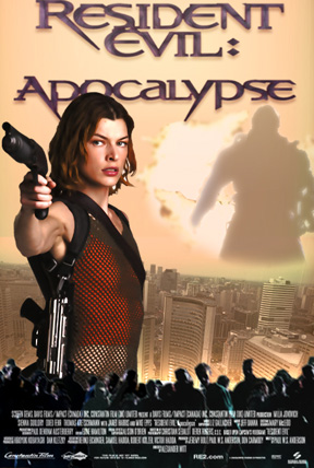
Nice, dramatic pose for main actress Milla Jovovich, with dramatically improved lighting abd shading from the source pic. Changed hue of city. Made custom zombie layer from awful supplied photo of zombies that originally left much to be desired. Some recoloring, brightness & contrast changes, and duplication fixed that. As the evil Nemesis character is vital to the sequel, his likeness appears in every design that I came up with. The explosion behind him was actually taken from an image of a car exploding. After tossing the billing block on the bottom and giving the title treatment a better look, this one was ready to go. |
 Design 1
 |
| |
Poster Design 2
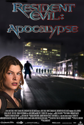
This design was all about composition and lighting, and I'm quite proud of the combination of those in the final image. With the background pic already having a strong light source to function as a backlight, a silhouetted approach was taken. Nemesis lends himself very well to appearing in silhouetted form, shapewise, but also in this case, due to the low quality of the provided source pic. You gotta work with what you're given, and get creative. The soldiers were then put in and given silhouettes, and all appropriate shadows were laid onto the ground. Billing at the bottom and a different style to the title treatment and I was happy enough to call this poster finished. |
 Design 2
 |
| |
Poster Design 3
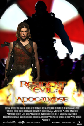
Love it!! Direct, up-front, in-your-face attitude that just says "bad ass!" Nothing subtle about this poster, and neither SHOULD there be. Adjusted the lighting on Milla to make her look just as bad as the Nemesis and zombies silhouetted behind her. Used the us Umbrella Corporation logo design, and added some cool flames behind the title. This title was my favorite of all the changes I made to it in the various poster designs. This poster was the only one that was actually genuinly fun to make. |
 Design 3
 |
|
|
